As a bit of a break from working on my large blocks for the quilt prints, I have printed up a number of smaller images based loosely on imaginary fabric patterns. This has also given me the opportunity to play around with transparent inks, which I have rarely done. I find my Daniel Smith transparent base absolutely impossible to work with. I think I should talk to someone at DS about that. My other DS inks are great, so why isn't this one??
So, for the moment, I am trying out Setswell Compound. It makes the ink feel really greasy and it takes ages to dry, but the colours become very transparent. There is also a bit of a problem with ink 'squish' around the edges of the blocks, but who said life was perfect.
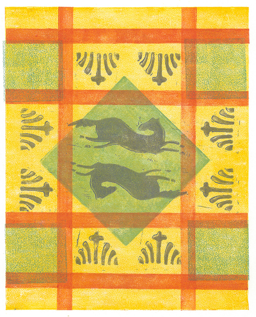
The Running Horse Plaid is a pretty jaunty little print. Well, it is not that small - 8"x10"image size - on BFK Rives Lightweight paper. I have all sorts of small blocks, so I sifted through them and came up with the ones I used for this print. OK, I did have to make the long blocks (printed in orange here). There was nothing particularly planned about this print. I just laid down the background yellow and then positioned various blocks on top of it until I had an idea of what I would print next. The colours were actually quite random as well. I had little smidges of ink saved from my quilt proofs and I just used those, watered down immensely with the Setswell.
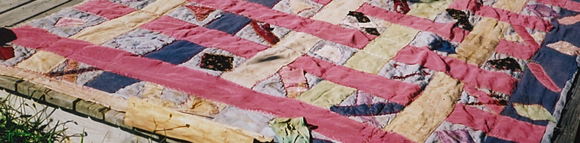
All in all, not a bad print - to my mind. It makes me think of a sunny kitchen, with this pattern on an old piece of oilcloth on the kitchen table. Part of an imaginary childhood out of a storybook I suppose. But the print is real, so who is to say that that kitchen didn't exist sometime, somewhere.


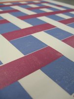
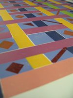 Most of the blocks are multi colour,so it means mixing up a whole batch of different colours and then finding enough small brayers for the inking. I think the fourth block has seven colours on it. The upper photo is the proof after printing two blocks and the lower photo is the proof after printing four blocks. One more block to go and then I'll see what I think of the result. I'm getting a feeling that I will want to make changes. So far the print looks too smooth, not like material at all. I know what I have to do to fix that, but it means making two more blocks. Or maybe three.