Monday, August 20, 2007

Red Fish Swimming


I have to admit I like a lot of the names I give my prints because they are often just off the top of my head and relate very directly to the print. So Red Fish Swimming really is about red fish swimming. You've got the fish, you've got the water - they have to be swimming - right?. And unless you are colourblind, yes they are red.

Sunday, August 19, 2007

Blue Horse Running


Another 'cobbled' together print.

The sky is from another reject block. What was I thinking at the time? It is a great block. Good thing I didn't throw it out. I learned that lesson a few years ago when I came across a proof of a print that I thought, at the time, was a lousy image, but years later saw that it was actually quite good. Did I still have the blocks? Nope. Too bad - so sad. I still have the proof though. The colours are a bit wishy washy, but the image definitely had potential. Sigh.

The landform is from a print that never made it through the proofing stage, but by this time I knew better and I saved the blocks and lo and behold this block is actually quite useful. I think I may have to make a few more blocks like this for more variety.

And the horse. Ah, that little horse block has been around for a long time now. When I first cut the block, I didn't have any real use for him. It was only a couple of years later in 1999 that I editioned him up in a print called Running Horse. And now he is continuing to run through all sorts of one-of-a-kind prints.

More Holland Willows


I have been on a bit of a printing binge lately and have been experimenting with a series of small one of a kind prints using a combination of existing and purpose cut blocks.

This print is made from two of my recent pollarded willow trees. The waves come from a block I made in 1995 (!) and the land under the trees comes from an envelope of blocks that never were completed as prints (it was fun going through those rejected blocks - not all of them were bad at all). The background block is one that I tend to use over and over and is the inspiration for the name of this print - Misty Day 2 (the first Misty Day sold too quickly for me to blog about it).
All in all, I like the freedom this random method gives me and I have made about 30 or so of these prints so far. Not all of them are willow trees!

Monday, June 04, 2007

Hassium

Hassium was synthesized in 1984 in Darmstadt Germany by Peter Armbruster, Gottfried Munzenberg et al. Atoms of lead were bombarded with ions of iron with a linear accelerator to produce Hassium. It is classified as a transition metal and its appearnce is unknown, but assumed to be silvery white or metallic grey. It is highly radioactive. The name Hassium comes from the Latin for the German State of Hesse where Darmstadt is located.

This information was not a lot to go on, but as you can see I managed. By combining the (old) symbol for radioactivity, with a portion of the Hesse Coat of Arms (rampant lion) and a Gothic style font (Germanic in feel) I came up with my version of the element Hassium for the Periodic Table Printmaking Project.

Friday, June 01, 2007

Periodic Table Printmaking Project

This is a print of one of my blocks for the Periodic Table Printmaking Project started by azuregrackle from Etsy.

I chose Hassium which, as it turns out, is one of those completely unknown elements. It was created in 1984, but there does not seem to be any use for it - maybe because it is radioactive!. It is a transition metal (hmmm - transitioning from something else or to something else?) and it might be a silvery colour. Not too much to go on visually.

So my starting point was the word Hassium, which is Latin for Hesse, the state in Germany where Hassium was discovered. This lion is part of the Hesse coat of arms. I am going to work in the notion of radioactivity as well. For my text (we have to show the periodic symbol and number on the print) I am going to use a Gothic font which could be considered Germanic.

Tuesday, May 29, 2007

Holland Willow and Double Willow


Staying true to the tree theme.

I like the look of pollarded trees with their thick knotted stumps. I suppose I like them because of the interesting shapes that are created by this style of pruning. It is the polar opposite of pruning a tree to enhance its natural form. And it is a form of pruning rarely seen in North America. The Getty Museum in California has pollarded trees as part of its landscape design and I have seen individual pollarded trees here in Toronto, usually on people's front lawns. But not as part of a designed urban landscape. Maybe it would cost too much to prune the trees all the time.

These prints are willow trees in Holland which are pruned every few years to create a crop of supple willow branches. I believe they are pruned just high enough so that the branches aren't eaten, but low enough for easy harvest. Though I wonder if the willow branches are still harvested at all. . I would like to make a larger print with a number of pollarded willows receding into the distance in a marshy landscape.

Double Willow is available for sale here.  Holland Willow is available for sale here.


Monday, May 28, 2007

Cloud Pine


I am staying simple for the moment and concentrating on trees.


This is a cloud pruned pine tree and is my print for Print Zero Studios' Print Exchange V. So far there are two confirmed exhibitions - the Florida Printmakers hosting at the University of Florida and the Sev Shoon Art Center/ BallardWorks who are hosting in Seattle. Their last exchange had 285 participants from from 18 countries and the show travelled to four states in the US.

Monday, May 07, 2007

Winter Trees


Simplicity achieved.

A simple rendition of winter trees against a snowy furrowed field. The starkness is just what I need in my printmaking life at the moment. Clean and cool and refreshing.

Winter Trees is available for sale here.

Wednesday, April 18, 2007

Multiple Squares Quilt Finished


The finished print. It took a long time from initial sketch to final print, but I am happy with the result.

I made the sketch last November/December and finished printing the edition during the first week of March. That is quite a lot of time for a low tech block print, though I was working on the Rayon Dress Quilt as well as a number of other prints at the same time ( and there is the day job which does eat into the time available). But I found that every step of the quilt prints took a lot longer than I thought. More planning.... more blocks... more proofing.... more revisions to the blocks.... proofing again.... hitting my head against the wall.... etc. etc. etc.

So my thoughts now are turning to simpler images and prints where I can get some immediate gratification. More spontaneity and less focus on process (even though printmakers love process).


Multiple Squares Quilt is available for sale here.

Tuesday, April 17, 2007

Multiple Squares Quilt - Work In Progress


A work in progress shot of the print that I have called the Multiple Squares Quilt. The print is based on one of my grandmother's quilts. Most of her quilts are composed of long strips of material, but this one is made of many small squares and must have taken much more time to make than most of the other quilts. I wonder if she worked on this in the winter time, when there would have been fewer visitors able to get to the farm on Southeast Ridge near Mabou, Cape Breton.


Monday, April 16, 2007

The Red Flute

Just a small print for fun. This was a bit of a break from all of the larger quilt prints I working on at the time. It was so nice to cut and print this one over a few days. For sale here.


The quilt prints were taking a huge amount of time in terms of making the blocks, proofing them, revising the blocks, reproofing. I was starting to drive myself mad with them.

Sunday, April 15, 2007

Ingrid's New Golf Socks


So there I was wanting to make a print of argyle patterned socks. I don't know where that idea came from. The ether I suppose. At any rate, the idea was there so I pursued it, except that I didn't end up with argyle socks at all. They are socks alright, just not argyle ones.

I brought a proof of the print into work and I was thinking to myself 'Who in the world would actually wear socks that looked like this?. I mean, look at the colour and pattern combination. The robin's egg blue, the Dijon mustard yellow, the harsh red. No self respecting person would ever wear these. They are quite ugly'. But then I thought - maybe Ingrid would. (Obviously another thought out of the ether.)

To my surprise, when I showed them to her, Ingrid said they would make great golf socks. She is an avid golfer and, I suppose, has paid attention to fashion on the golf scene - unlike myself. So I asked if I could name the print after her and that was fine except she asked me to put the word 'new' in the title. As Ingrid explained it, she is terribly hard on her golf socks and they have holes in them all the time.

Available for sale here.

Saturday, January 20, 2007

Rock and Waterfalls


My first rock and waterfall print - one with a Van Gough sky too!

I have done a number of later rock and water prints, but this one is still my favourite. I think it is the contrast between the sinewy rocks and the straight lines of the water that I like. I think the whole print has an Art Deco flavour.

The keyblock is linoleum (I think it was a flooring sample) and the backing blocks are cardboard with a bit of texture added - if I remember correctly!

Available for sale here.

Saturday, January 13, 2007

Along the Cabot Trail


About 18 months I ago I went around the Cabot Trail in Cape Breton and I took all of the usual photos of the ocean and headlands. Typical tourist stuff. But when I was going through them recently I found one of a rock face along the highway. Now I love rocks, but I am rarely satisfied with the way I cut them so I decided to have a go at these with a new set of cutting tools.


The keyblock holding all of the detail is linoleum and the backing blocks are cardboard with added textures, though the textures are pretty subtle. I like the overall effect and the colour combinations. The colours in no way resemble real life, but that's fine with me.

Available for sale here.

Sunday, January 07, 2007

More Fabric Prints


Well I am still experimenting with fabric prints while I finish off the blocks for my quilt prints. I am working on two quilt patterns at the moment. One is the Rayon Dress Quilt and the second is tentatively called Fancy Squares Quilt. When I look at that title on this page, it looks pretty bad, so I'll likely change it.


My problem is I keep on adding blocks for the quilt prints and now I am starting to dread the actual printing as I know that it always takes longer than I anticipated. I am preparing these two prints for a show in March, which sounds like oodles of time, but...... I know it really isn't (the day job takes up my days after all). So getting sidetracked by the smaller prints is not the best strategy, but I can't help myself.

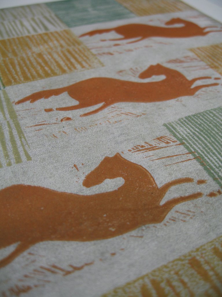
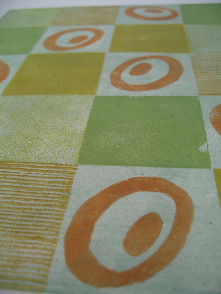
These prints use and reuse a series of small blocks. Some are many years old and were used in editioned prints. Others I have cut specifically for this series of prints and now I have a box full of them. Selecting the blocks is as bad as trying to decide what to wear to work:

- Out comes the box.
- Out spill all the blocks.
- Some of the blocks are put down in this or that combination and considered.
- Hmmm, well lets take these away and try those instead.
- Ouch, that didn't work.
- If I do this instead of that, does it look better?
- Yes, no. Yes, no. Yes, maybe......
- OK, just move this over here, switch this one for that one and...
- Well this might work, but what if I move....

You can see how it goes and I haven't even thought about colours yet.

Since these prints are exploratory in nature I am not printing editions, just one of each and listing them in my Etsy shop.